"Mobilegeddon: What you need to know."
Google launched its "mobile-friendly" or mobile search algorithm more than two months ago, causing some marketers, website owners and others whose livelihoods are dependent on it to worry about how the changes will affect them and, ultimately, consumers.Google announced the change on its Webmaster Central Blog in February, explaining the change with the statement below, giving advance warnings and following up with subsequent statements and interviews:
Starting April 21, we will be expanding our use of mobile-friendliness as a ranking signal. This change will affect mobile searches in all languages worldwide and will have a significant impact in our search results. Consequently, users will find it easier to get relevant, high quality search results that are optimized for their devices.Google defines “mobile friendly” as sites featuring readable text without zooming, content sized to a smartphone screen (no horizontal scrolling required), easy use of links and the absence of applications not customary in mobile like Flash.
Google also provided tools that allow website developers to test their pages for mobile friendliness and check for issues. Website owners can plug their URLs into Google’s “mobile-friendly test” bar and find out instantly if their site passes muster.
The change will only affect mobile search results, and will not impact desktop search or Google News results.
The change was described by the Silicon Valley search giant as a way to help mobile users find more high-quality content that is optimized for their devices, but many smaller companies and even some large ones worry that they will get left behind after the changes are implemented.
Yet, according to various websites and bloggers, since the launch, tracking companies and webmasters are not seeing all that much of a difference in the mobile Google results, but some are noticing slight changes in the mobile search results.
Google also reported it will now use information from indexed native mobile apps “more prominently in search,” as new app indexing enables Google to index apps just as it does websites. This applies to the Android app world, and is likely to be extended at some point to iOS.
What is an algorithm?
Google has changed algorithms in the past. Each year, Google changes its search algorithm between 500 and 600 times. Most of these changes are minor. However, Google's latest algorithm change outranks both Panda and Penguin in terms of its scale of impact on search results, according to Google's Webmaster Trends analyst Zineb Ait Bahajji.The change comes down to one very important criterion: whether your website, landing pages, and blog are fully optimized for mobile.
To make a computer do anything, you have to write a computer program. To write a computer program, you have to tell the computer, step by step, exactly what you want it to do. The computer then "executes" the program, following each step mechanically, to accomplish the end goal.
When you are telling the computer what to do, you also get to choose how it's going to do it. That's where computer algorithms come in. The algorithm is the basic technique used to get the job done.
Google's algorithm change comes at a time when mobile-device usage passed PC Internet usage for the first time last year, as CNN Money reported, and data from Pew Research shows that 64 percent of Americans own a smartphone. A full 7 percent of U.S. adults are completely dependent on their smartphones for Internet access.
Google manages some 200 algorithms that govern how websites are ranked in its search engine, but changes or adjustments rarely, if ever, trigger public notice. This time, Google announced the change in mobile search months ahead to give companies time to optimize websites for mobile users.
Test Your Website For Readiness
Google provided website owners with a free tool well in advance to tell them exactly what is needed to prepare for the new mobile search algorithm. You can access the tool here.If your website is fully optimized for mobile, you'll get a success message like this one:
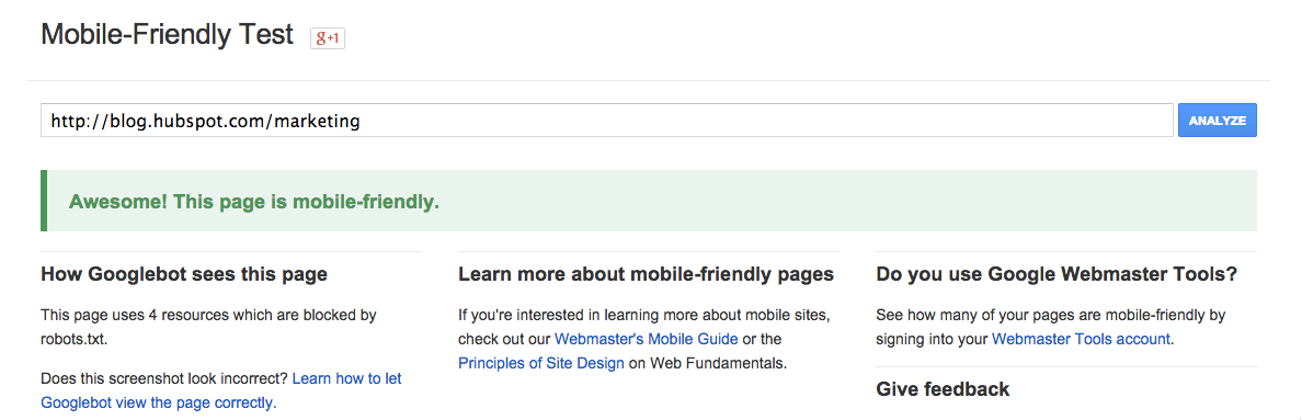
You'll also get a visual of how the Googlebot "sees" your website. If your website, landing pages or blog are not ready for the mobile update, you'll get a message that looks like this:
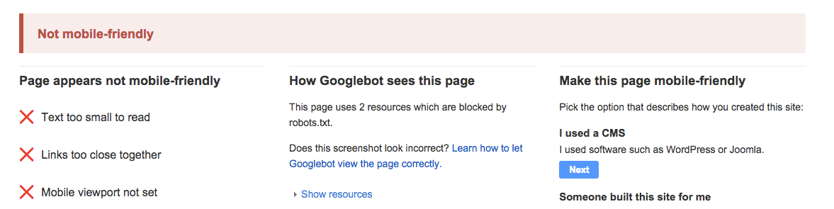
Along with the failure message, you'll get a few pointed bullets on the reasons your content failed the test. Above, you can see the mobile viewport is not set, the links are too close together, and the text is too small to read. While this may seem like you'll need to do a whole detailed redesign to fix each error, moving to a mobile optimized content management system, blog, or landing page tool will likely fix most of them.
Google Webmaster trends analyst Gary Illyes shared a few details in a recent Q&A. Most notably:
- Responsive design does not have a ranking benefit
- Googlebot must be allowed to crawl CSS & JavaScript to pass the "mobile-friendly" test
- Mobile friendliness is determined at the page level – not sitewide
- Tablets will not be affected by this update
- Google is currently working on a dedicated mobile index
Choose Your Mobile Optimization Approach
If any of your content isn't optimized for mobile, you have options. Google recognizes three different configurations as "mobile friendly." You can move your content to any of the following set-ups and be protected from the change.1) Responsive Design. The reason responsive design is so desirable is that it doesn't create two copies of the same site. Viewers only have one URL to go to and the website will adapt as they move from phone to tablet to desktop and beyond.
2) Dynamic Serving. Like responsive design, a dynamic serving approach keeps the same URL -- but this time, the HTML actually changes. Dynamic serving uses user-agents to "sniff" out what kind of device the viewer is using and then dynamically serves up the appropriate view.

3) Mobile Website. Creating a separate mobile website was one of the earliest versions of mobile optimization, and it still works for Google's requirements. Upon a new user arriving, this configuration tries to detect the users’ device, then redirects to the appropriate website using redirects.
In addition to the mobile-optimization tool, Google has also put together a list of common mistakes to avoid in optimizing your site for mobile devices and the algorithm change. These mistakes include using flash video and other unplayable content types on mobile as well as having a slow mobile site.
Frequently Asked Questions
Here are a few remaining questions you might have about the change.1) I'm not ready for a redesign. Do I have to do this now? You may not need to fully redesign it now to comply with Google's requirements for mobile-friendly sites. What you do need to do is move your existing site, blog or landing pages to a mobile friendly platform. (Note: HubSpot can migrate your existing site for you to make it responsive without altering the existing design very much. Whether you're a HubSpot customer or not, you can request information about that here.)
2) Is my site permanently penalized if I don't optimize for mobile now? No -- you can rebuild search credit after the fact. But you should try to move quickly on it because every day that your site isn't optimized for mobile is a day that you'll lose traffic. Estimates of mobile search volume vary by industry, but one thing researchers have seen is that companies with mobile-optimized sites triple their chances of increasing mobile conversation rate to 5% or above.
3) What other elements should I consider in optimizing my website for mobile? In addition to ensuring that the site loads properly and the font is big enough for mobile, you'll want to consider the length of your forms on mobile devices. If you have a landing page tool that allows you to swap out forms for people visiting on mobile devices, build shorter forms into your strategy.
You also may want to think about how the behavior visitors exhibit on mobile devices differs from that of desktop viewers and begin to adapt your content strategy.


